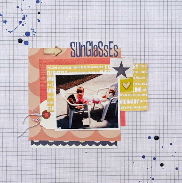
This was a different color scheme for me but I enjoyed it. I kept a neutral background with a white grid patterned paper. Some simple embellishments, a tag with some twine, a few wood veneers, some enamel dots and mist. Done!
I liked the idea of a title with capital and lowercase letters to bring out that playful feel. Those letters from Jillibean Soup are some of my favorites.
Thanks for stopping by!
Christine <3


Love the layout and the mixed lettering for the title is great!
ReplyDeleteCute picture and great layout!
ReplyDeleteWhat a great picture to find! Love how you scrapped it.
ReplyDelete